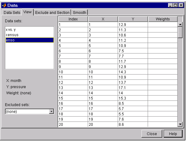
Viewing data numerically
You can view the numerical values of a data set, as well as data points to be excluded from subsequent fits with the View tab of the Data GUI. The tab is shown below followed by a description of its features.
-
Data sets – Lists the names of all data sets added to the Curve Fitting Tool. The variable names associated with the selected data set are displayed below this list.
When you select a data set, the predictor data (X), response data (Y), and weights (if imported) are displayed in the table. If the imported data contains Infs or NaNs, then those values are labeled “ignored” in the appropriate column. If the imported data contains complex numbers, then only the real part is displayed and used.
-
Excluded sets – Lists all sets of excluded data that are compatible with the selected data set. When you select an excluded set, the data points that will be excluded from the fit are grayed in the table. To exclude the data points while fitting, you must select the excluded set in the Fitting GUI.
An excluded set is compatible with the selected data set if their lengths are the same, or if it is created by sectioning only.
You can exclude data points from a data set with the Exclude and Section tab of the Data GUI.
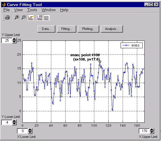
Viewing data graphically
After you import a data set, it is automatically displayed as a scatter plot in the Curve Fitting Tool. The response data is plotted on the vertical axis and the predictor data is plotted on the horizontal axis.
The scatter plot is a powerful tool because it allows you to view the entire data set at once, and it can easily display a wide range of relationships between the two variables. You should examine the data carefully to determine if preprocessing is required, or to deduce a reasonable fitting approach. For example, it’s typically very easy to identify outliers in a scatter plot, and to determine if the data can be fit by a straight line, a periodic function, or a sum of Gaussians.
Enhancing the graphical display
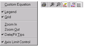
The Curve Fitting GUIs provide several tools for you to enhance the graphical display of a data set. Using the Tools menu and the GUI toolbar, you can zoom in, zoom out, display data and fit tips, and so on.
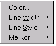
Using the right-click menu, you can change the color, line width, line style, and marker type of the data points. You activate this menu by placing your mouse over a data point and right clicking. Note that a similar menu is available for fitted curves.
The ENSO data is shown below after enhancing the display using several of these tools.